


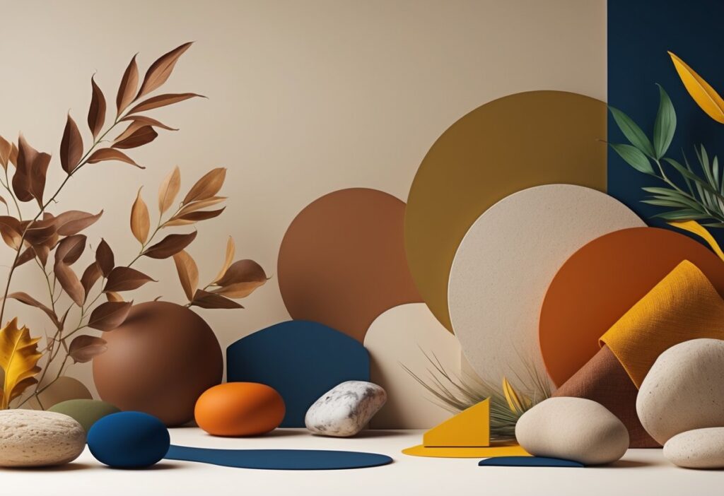
The colour landscape for 2025 marks a shift toward grounded, sophisticated hues that blend comfort with a touch of style. 2025’s dominant colour trends revolve around muddied earth tones like truffle brown and dusty terracotta, paired with dramatic accents like eggplant purple and chartreuse yellow.
These aren’t your typical bold colours. They’re complex, nuanced shades that carry depth and a sense of timelessness.
Gone are the stark contrasts and fleeting brights that dominated recent years. Now, you’ll probably find yourself drawn to colours that feel familiar but sophisticated—think dusty blues that whisper, not shout, and muddy pinks with brown undertones that create warmth without being too much.
These trending colours reflect a craving for spaces that feel calming yet visually interesting. The beauty of 2025’s palette lies in its versatility.
You can create stunning combinations by pairing earthy neutrals with bold jewel-tone accents. Or, keep things minimal with various shades from the same colour family.
Whether you’re planning a total room makeover or just want to refresh your space with new accessories, these colours offer endless ways to make your home feel current and enduring.
Key Takeaways
- Earthy tones with muddy undertones lead the way in 2025, replacing bright and stark colour schemes.
- Bold accent colours like eggplant purple and chartreuse add dramatic contrast when used thoughtfully.
- These colour combinations work for both minimalist and statement-making interior designs.
The Essence of 2025 Colour Trends
The colour landscape of 2025 moves away from the cool greys of recent years. We’re seeing a shift to warmer, more complex tones.
This change reflects not just technology, but a real longing for authentic connections to natural elements. Your colour palette is evolving beyond the sterile greys of the past decade.
Stark minimalism is fading out, making room for colours with earthy undertones and real depth. Truffle brown leads this transformation—a rich chocolate-meets-taupe shade that offers versatility grey never did.
It pairs beautifully with both soft neutrals and bold accent colours. Dusty blue is replacing those harsh steel greys, carrying a bit of history while staying modern.
It works especially well in spaces like hallways and kitchens. The shift touches pinks, too.
Muddy pink with brown undertones brings a sophistication that millennial pink just didn’t have. Paint company Little Greene’s Mochi colour of the year nails this trend.
These grounded colours help spaces feel lived-in, not sterile. They provide warmth without overwhelming your senses.
Why Earthy Meets Bold in 2025
Your design choices now reflect two competing desires: stability and expression. Earthy bases with bold accents strike a balance between both.
Eggplant purple shows this off. It’s a deep, sensual tone that works as a dramatic statement or even a sophisticated neutral.
Use it on walls or bring it in through furniture and textiles. Chartreuse brings unexpected vibrancy—a yellow-green hybrid that acts like a neutral when paired with darker tones.
It’s been showing up on runways for seasons and translates surprisingly well to interiors. Earthy tones ground these bold colours, making combinations like dusty red dramatic but not overwhelming.
Dusty red gives drama without the intensity of pure red, so you can use it on larger surfaces like sofas or feature walls. This mix reflects how complicated modern life is—spaces that feel calm but still stimulating, traditional yet contemporary.
Earthy Neutrals: The Heart of the 2025 Palette
Earthy neutrals anchor 2025’s colour trends. We’re moving past basic beiges and into sophisticated taupes and creamy whites.
These complex hues create calming spaces and provide a perfect backdrop for bolder accents. Taupe is the standout neutral for 2025, pushing aside those cooler greys.
This sophisticated colour blends grey undertones with warm brown hints, adding depth without overwhelming. Modern taupe shades work great in living rooms and bedrooms, especially with wooden furniture and brass fixtures.
Unlike stark whites, these colours add warmth but still keep things clean and contemporary. Key Taupe Variations for 2025:
- Mushroom taupe – soft and sophisticated
- Clay grey – earthy with subtle pink undertones
- Greige blends – combining grey and beige elements
Warm whites are replacing those clinical, bright whites. Creamier tones with subtle yellow or pink undertones create a cosy atmosphere.
They work well on trim, ceilings, and feature walls. Layering different brown and beige tones brings rich, textured spaces that feel naturally harmonious.
Start with a light base and add deeper browns through furniture, textiles, and accessories. Cocoa brown makes a great accent wall colour.
Pair it with cream whites and soft beiges for a balanced look. These combos feel grounding and encourage relaxation.
Effective Layering Techniques:
- Stick to three shades max in one room
- Mix up textures—paint, fabrics, natural materials
- Use darker browns sparingly for depth
Muted beiges with grey undertones work in any room. They complement both modern and traditional furnishings and give you a neutral canvas for art and decor.
Nature-Inspired Greens: Calming and Versatile
Green colours in 2025 focus on softer, earthier tones. They create peaceful spaces and offer great flexibility in design.
Light sage and muted forest greens are leading the trend, leaving behind those bright or neon variations. Light green shades, especially sage, dominate the 2025 palette.
These colours echo natural landscapes and help create calm environments at home. Sage Green Benefits:
- Reduces stress and helps you relax
- Works well in bedrooms and living areas
- Pairs beautifully with natural materials
HGTV Home by Sherwin-Williams picked Quietude, a soft sage green, as their 2025 Colour of the Year. That says a lot about the desire for peaceful, mindful living spaces.
Light greens look great with brass fixtures and wooden floors. Use these shades on accent walls or kitchen islands for a real impact.
Psychologically, light greens encourage creativity but keep things calm and confident. Muted greens like olive, moss, and pickle green offer sophisticated alternatives to brighter versions.
These deeper tones ground your space while keeping the calming benefits of green. Popular Muted Green Options:
- Pickle Green: Deep, forest-like shade
- Olive Green: Warm, earthy tone
- Moss Green: Soft, natural hue
Pickle green works especially well in kitchens and dining areas. Pair it with rich textiles and natural wood for a luxe, organic feel.
These colours suit both minimalist and traditional designs. Bring muted greens in through furniture, cabinetry, or statement walls.
Not sure about going all-in? Try muted greens in accessories like cushions or artwork before painting large surfaces.
Earthy Reds and Terracotta: A Sophisticated Statement
Earthy reds bring natural warmth and depth to your spaces. Terracotta adds texture and visual interest without overpowering a room.
The Appeal of Earthy Reds
Earthy reds offer a refined twist on classic bold reds. They draw inspiration from desert cliffs and baked clay.
Clay terracotta stands out for its versatility. It brings Mediterranean warmth to living rooms and kitchens, pairing well with natural materials.
Deep clay reds create striking focal points in dining rooms, especially when balanced with neutrals like cream or soft grey. Burnt orange-red tones add energy without being too much.
Try them on accent walls or painted furniture. The best thing about earthy reds is how they feel both grounding and energising—connecting interiors to nature but still feeling modern.
Terracotta for Warmth and Texture
Terracotta instantly warms up any room with its rich, earthy undertones. It’s perfect for spaces where you want a cosy vibe.
Kitchen applications include terracotta backsplashes or cabinets. Pair with natural wood and brass for a sophisticated look.
Bathrooms benefit from terracotta tiles or painted walls. Combine with natural stone for a spa-like feel.
Accent wall applications let you try terracotta without a huge commitment. Pick one wall to showcase this warm shade.
Terracotta’s texture comes from its clay roots, adding visual depth and making rooms feel more layered than flat paint ever could.
Jewel Tones and Bold Accents: Adding Drama
Rich jewel tones like garnet, emerald, and sapphire bring luxury and personality to your home. These vibrant colours work best as accent walls or focal points.
Garnet, Emerald, and Sapphire
Deep garnet red creates a warm, sophisticated atmosphere in dining rooms and bedrooms. This burgundy shade pairs nicely with brass fixtures and cream furniture.
Emerald green brings a touch of nature indoors while keeping things elegant. Try it on kitchen islands or in home offices where it might help with focus and creativity.
Sapphire blue adds depth and tranquillity to living spaces. It works especially well in powder rooms or as a statement colour behind bookshelves.
| Jewel Tone | Best Rooms | Pairs With |
|---|---|---|
| Garnet Red | Dining rooms, bedrooms | Brass, cream, gold |
| Emerald Green | Kitchens, offices | White, natural wood |
| Sapphire Blue | Living rooms, bathrooms | Grey, silver, white |
Accentuating with Accent Walls
Accent walls give you a chance to play with jewel tones, even if you’re not ready for a full room overhaul. Pick a wall that naturally grabs attention—maybe the one behind your bed or sofa.
Paint that wall in your favorite jewel tone and leave the others neutral. This adds visual interest and can actually make the space feel bigger, not boxed in.
Try jewel tones on features like alcoves or chimney breasts. These spots become real showstoppers when you splash on emerald or sapphire.
If you rent, removable wallpaper in jewel tones is a smart move instead of painting.
Design Strategies for Harmonious Palettes
Working with 2025’s earthy tones means thinking about proportion and placement. The trick is using bold accents in just the right spots, so things stay balanced and not chaotic.
Pairing Earthy Tones with Bold Accents
Start with an earthy base as your main colour—cover about 60-70% of the space. Terracotta, warm browns, or olive greens make a solid foundation.
Add bold accent colours to 20-30% of the room. Think furniture, artwork, or a feature wall. Electric green, vibrant yellow, or deep blue all work.
Effective pairing combinations include:
- Cinnamon brown walls with electric green cushions
- Terracotta base with sapphire blue accessories
- Warm grey foundation with ruby red artwork
Use neutral bridging colours for the last 10-20%—cream, soft beige, or warm whites help tie everything together.
Mix up textures in the same colour family. Raw linen in terracotta with glossy ceramics keeps things interesting without clashing.
Scale and Balance in Colour Placement
Follow the 80-20 rule for colour distribution. Use earthy tones for 80% of the fixed stuff—walls, floors—and save the bold shades for 20% of the moveable pieces.
Large-scale applications work best for:
- Earthy tones on walls and floors
- Neutral colours on major furniture pieces
- Soft accent colours on window treatments
Small-scale applications suit:
- Bold accent colours in artwork and cushions
- Vibrant hues in decorative objects
- Statement colours in lighting fixtures
Put bold accents at eye level or on natural focal points. A bright painting above the sofa or colourful cushions on a neutral couch always catch the eye.
Balance warm and cool shades across the room. If your base is warm, try adding cool-toned accents on the other side for a more balanced look.
Implementing 2025 Colours at Home
Your finish choice really matters, and where you put colour makes a huge difference. Think about lighting and what you already own before picking paint sheens or textures.
Choosing Finishes and Textures
Matte finishes suit earthy shades like terracotta and olive green. They add depth, hide wall flaws, and keep the vibe natural.
Eggshell or satin finishes work for bold accents like deep cobalt blue or raspberry pink. These sheens bounce light just enough, making colours look richer without too much glare.
Limewash or clay paints bring a lovely texture to earthy tones. They add an organic feel that fits right in with natural palettes.
High-gloss finishes shine on kitchen cabinets in bold colours like burnt orange or blackened purple. They’re easy to clean and make colours pop.
Pick finishes based on the room. Bathrooms need moisture-resistant satin or semi-gloss. Living rooms do well with eggshell finishes for a nice balance of durability and warmth.
Room-by-Room Application Tips
Bedrooms look great with cocoa brown or pale sage on one wall. Keep the rest neutral for a calm feel. Bring in bold colours with bedding or art, but don’t overdo it.
Living rooms can handle more colour. Paint a wall burnt orange or deep cobalt, and echo that colour in cushions and accents.
Kitchens are fun for colour experiments. Try terracotta cabinets and neutral walls, or make the island pop with raspberry pink.
Bathrooms can go bold since they’re small. Deep cobalt or blackened purple looks dramatic but not too much.
Home offices need a bit of energy, so muted mustard on one wall works. Keep furniture neutral to avoid distraction.
Hallways are a great place to try bold colours. You’re just passing through, after all.
Frequently Asked Questions
People have a lot of questions about using these colour trends in different places. The move toward earthy tones and bold accents seems to reflect a bigger cultural shift—maybe we’re all craving more mindful, sustainable design?
What are the predominant earthy tones in fashion for 2025?
Truffle brown leads the earthy palette for 2025. It’s this rich, chocolate-taupe shade that works in all sorts of fashion categories.
Dusty terra-cotta and muted clay pinks show up on the warmer side. They’re sophisticated without being loud.
Sage greens and dusty blues are the cooler options. Designers seem to prefer these softer, less flashy versions.
Mushroom greys and sandy beiges round things out. They’re versatile bases that make it easy to add bolder accents later.
Which bold accent colours are most popular in interior design this year?
Eggplant purple is the big one for 2025. It’s dramatic but still feels refined.
Chartreuse yellow pops up as a sharp contrast to earthy backgrounds. Designers use it sparingly for a reason—it grabs attention fast.
Dusty red is in, replacing last year’s bright crimson. It’s warmer and less in-your-face.
Muddy pinks with brown undertones are doing double duty as both earthy bases and subtle accents. They bridge the gap between bold and neutral.
How can earthy tones be effectively incorporated into home decor?
Start with big furniture pieces in truffle brown or mushroom grey. These set a calm, grounded mood for the room.
Layer in clay pinks and sage greens with cushions, throws, or curtains for extra depth. It’s an easy way to add interest without a big commitment.
Use earthy tones on accent walls to define spaces. Dusty blues work especially well in hallways or kitchens.
Bring in natural materials like wood, stone, or dried florals. They echo the colours and make the look feel genuine.
What methods are designers using to integrate bold accents into 2025’s colour palettes?
Designers are all about strategic placement for bold accents this year. Usually, it’s one statement piece instead of a bunch of bright stuff everywhere.
Eggplant purple shows up in lacquered furniture and plush fabrics. It works as both a paint colour and a finish.
Chartreuse accents come in through decor and art. Pairing them with rich golds like Bosc Pear really makes them sing.
Dusty red is flexible—it works for whole feature walls or smaller bits like drapes.
Which industries are most influenced by the earthy tone and bold accent trend?
Interior design leads the way, especially in homes and businesses. Paint and flooring companies are driving much of this trend.
Fashion retail is on board too, with earthy tones in everything from leather bags to sweaters. It’s not just high-end—affordable brands are in on it too.
Stone and tile makers report more demand for purple-veined marble and burgundy finishes. Natural materials in these shades are becoming more premium.
Home goods stores are selling more wooden decor, dried florals, and brown textiles. It’s all part of the bigger move toward cozy neutrals.
How are 2025’s colour trends reflecting broader cultural or environmental themes?
We’re seeing a shift toward “muddied” colours, which moves us away from the usual digital brightness. These shades echo the patina on aged materials and the look of weathered surfaces.
Earthy palettes are showing up everywhere, probably because of rising environmental awareness. They tie right into biophilic design ideas and help us feel connected to real landscapes and organic textures.
There’s definitely a preference for introspective tones lately. People seem to crave calm colours that encourage reflection, especially when everything else feels so chaotic.
Art Deco revival is sneaking in, too, adding a layer of sophistication to the colours we see. That nod to history gives the palette more meaning than just picking what’s trendy.