


Your home is your canvas. The era of endless beige and grey walls? That’s over. Bold colours, Victorian-inspired wallpaper, and eclectic collections are turning modern interiors into spaces that really show off your personality and style.
This approach mixes the rich heritage of 19th-century decorative arts with a modern sense of confidence. You end up with a home that tells your story—one that feels uniquely yours.
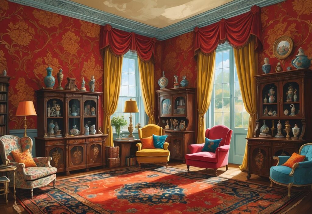
Victorian wallpaper, once known for its elaborate patterns and deep shades like burgundy, gold, and purple, is making a comeback. The latest versions blend ornate historical design with fresh, personal twists that actually work in both old houses and new builds.
The eclectic interior movement encourages mixing styles, textures, and bold colour schemes. You get a look that’s cohesive but unmistakably personal. It celebrates the Victorian love of variety, while letting you bring in modern touches and luxury details that reflect your taste.
Key Takeaways
- Bold colours and rich hues are replacing neutral palettes to create more personalised and vibrant living spaces
- Victorian-inspired wallpaper offers elaborate patterns and ornate designs that add character and historical elegance to modern homes
- Eclectic interior design allows you to mix different styles and textures to create a unique space that reflects your personality
Vibrant Colour Palettes And Eclectic Décor
Eclectic decorating lets you mix bold colours without following strict rules. You can pair jewel tones with bright pastels or throw emerald green together with sunny yellow just because you like it.
Start with a neutral base like white or grey walls. Add pops of vibrant colour through furniture and accessories. That way, your space stays balanced but still feels lively and personal.
Popular eclectic colour combinations include:
- Rich terracotta paired with deep indigo
- Mustard yellow with emerald green
- Coral pink with seafoam blue
- Bold orange alongside royal purple
Designers usually suggest picking three main colours for your palette. Use one as the main shade, another as secondary, and the third as an accent. Even with contrast, this keeps things harmonious.
The Arts and Crafts movement loved rich, earthy colours. Deep reds, forest greens, and warm golds mix beautifully with today’s brights.
Layer different textures to support your colour choices. Velvet cushions in jewel tones look great with printed throws in contrasting shades. Brass or copper accents add warmth to cooler colour schemes.
Your styling should show off who you are. Don’t stress about matching everything. Eclectic decorating is about those unexpected combos that make your home feel like yours.
Lighting matters. Natural light brings out true tones, while artificial lighting can totally change how a colour looks in your space.
Victorian‑Inspired Wallpaper To Express Personality
Victorian wallpaper gives you endless ways to showcase your style. The Victorian era brought out some of the most dramatic and sophisticated patterns in history.
You can go for traditional shades like navy, burgundy, and gold if you want that real period vibe. These colours capture the grandeur of Victorian interior design.
Or try a modern twist with brighter hues. Red, turquoise, and yellow Victorian patterns bring a burst of energy to classic designs.
Key Victorian wallpaper features include:
- Intricate damask patterns
- Elaborate floral motifs
- Rich scrollwork details
- Arts and Crafts movement influences
The Gothic Revival movement shaped a lot of Victorian patterns. Expect bold geometric designs mixed with ornate decorative elements.
Victorian wallpaper works in both old and new homes. It adds character to modern spaces and fits right in with traditional furnishings.
Pattern choices reveal your personality:
| Pattern Type | Personality Expression |
|---|---|
| Bold damask | Confident, dramatic |
| Delicate florals | Romantic, gentle |
| Geometric designs | Structured, modern |
| Rich scrollwork | Luxurious, sophisticated |
You can use Victorian wallpaper on just one wall for subtle drama. Or go all in and wallpaper an entire room for that immersive Victorian interior vibe.
The intricate details celebrate both history and artistry. Your choice of Victorian patterns can turn an ordinary room into a sophisticated space that’s all about your own taste.
Move Away From Grey: Embracing Rich Hues
Grey dominated interior design for years. It felt safe and modern, but honestly, that era’s fading fast.
Why grey is losing its appeal:
- Creates bland, soulless spaces
- Lacks warmth and personality
- Makes rooms feel cold and unwelcoming
Designers are now going for bold, expressive colours instead. These rich hues bring homes back to life.
Popular colour choices for 2025:
| Earthy Tones | Bold Accents | Deep Shades |
|---|---|---|
| Clay brown | Vibrant orange | Navy blue |
| Terracotta | Ochre yellow | Deep burgundy |
| Moss green | Saturated coral | Oxblood red |
Colour drenching is trending. Paint your walls, doors, and trim in the same deep shade for a dramatic, cocoon-like feel.
These warmer tones give your space instant personality. Suddenly, rooms feel inviting and lived-in instead of sterile.
Not sure where to start? Try accessories or a feature wall first. Warm neutrals like cream or stone still make great base colours.
The trick is picking colours that actually feel like you. Rich greens calm things down, deep blues bring sophistication, and earthy browns just make everything warmer.
Bold choices like these are perfect for personalised interiors. They set the stage for eclectic collections and statement wallpaper.
Frequently Asked Questions
Bold colours look best when you balance them with neutral parts of the room. Victorian wallpaper needs you to think about pattern scale and room size. If you love eclectic collections, try unifying them with a shared colour or material so things don’t feel chaotic.
How can one effectively incorporate bold colours into a period home without overwhelming the space?
Start with one bold colour as your focus. Use deep jewel tones like emerald green or ruby red on a single accent wall instead of everywhere.
Balance bold with neutral backgrounds. Paint three walls cream or soft grey and save your statement colour for features like alcoves or chimney breasts.
Try bold colours in textiles and accessories first—cushions, curtains, or artwork—before you commit to painting walls.
Think about natural light. Warmer bold colours like terracotta or golden yellow work well in north-facing rooms, while cooler tones are great for south-facing spaces.
What are the guidelines for choosing Victorian-style wallpaper that complements modern décor?
Pick wallpapers with classic Victorian patterns but in modern colours. Damask or florals in muted greys or soft blues feel fresh compared to the old dark jewel tones.
Pay attention to scale. Use large Victorian patterns on feature walls. Try smaller geometric prints on furniture or accessories.
Go for textured wallpapers instead of busy patterns if you want something subtle. Victorian-inspired textures can fit modern settings better than heavy florals.
Limit patterned wallpaper to one wall per room for a good focal point. That way, it won’t fight with modern furniture or clean lines.
Look for washable or wipeable wallpapers. Many Victorian-style papers now have protective finishes, so they work in kitchens or bathrooms.
What are the best practices for curating an eclectic collection in a cohesive way?
Find a common thread—maybe a colour, material, or era—that ties your collection together.
Group items in odd numbers like three or five for balance. It keeps things looking casual instead of stiff.
Mix up heights and sizes. Pair tall candlesticks with little boxes and medium vases for a more interesting look.
Don’t cram everything together. Leave space so each piece stands out, but still feels part of the whole.
Rotate your collections with the seasons. Swap things out to keep displays fresh and avoid clutter overload.
Can you mix different period features within a personalised interior design scheme?
Absolutely, as long as you stick with complementary colours and materials. Victorian ornate details can work with mid-century modern lines if you use similar wood tones.
Let one period be your base style. Add in pieces from other eras as accents.
Watch the proportions. Delicate Georgian furniture can sit next to Victorian pieces if their sizes and visual weights match up.
Unify different periods with a consistent colour scheme. Painting woodwork from different eras in the same shade helps tie things together.
Focus on quality, not strict period rules. Well-made pieces from different times often share craftsmanship that just works together.
What considerations should be taken into account when using bold colours in a small room?
Put bold colours on shorter walls to make small rooms feel wider. Paint the wall opposite the door in a deep colour, but keep the side walls neutral.
Lighter bold colours are your friend. Bright coral or yellow can energise a small space without making it feel cramped like navy might.
Use removable elements for bold colour—bedding, curtains, or artwork—so you can switch things up if it feels too much.
Think about ceiling height. Low ceilings need bold colours only on the walls, with white or pale ceilings to keep things airy.
Test colours at different times of day. Small rooms don’t always get much natural light, so make sure your bold choice looks good in both morning and evening.
How can one integrate personal collections without creating a cluttered look?
Set aside specific display spots for your collections. Built-in shelves, console tables, or wall-mounted cabinets work way better than scattering things everywhere.
Try playing with visual triangles when you arrange your pieces. If you guide the eye from one grouping to another in a triangular flow, the room just feels more balanced.
Furniture with built-in storage is a lifesaver for rotating displays. Cabinets with glass fronts let you show off your favorites while keeping dust at bay.
Keep the spacing between objects consistent, but don’t stress about perfection. Using your hand as a quick measuring tool works surprisingly well when arranging things on shelves or mantels.
Edit your displays without mercy—just pick your absolute favorite pieces to show. Tuck the rest away and swap them in now and then, so the space stays fresh and not overwhelming.