


Choosing the right colour scheme for your office isn’t just about looks—it can actually change how productive you and your team feel during the day. The colours around you at work influence mood, focus, and performance, with studies showing that strategic colour psychology can boost productivity by up to 13%.


Different colours hit your brain in different ways. Blue tones help you stay focused on detail-heavy tasks, while green reduces eye strain if you’re working long hours.
Red can give you a shot of energy when you need alertness, but too much might ramp up stress or create unnecessary competition. Whether you’re setting up a home office or rethinking your workplace, knowing how colour affects productivity helps you build a space that actually works for you.
From calming hues for high-stress environments to energising shades for creative corners, the right colour palette can totally transform your workspace.
Key Takeaways
- Colour psychology shapes workplace productivity, with some hues improving focus, creativity, and alertness.
- Blue helps concentration and eases mental strain, green prevents eye fatigue, and red increases energy (but should be used sparingly).
- Different work zones call for different colour schemes to match their purpose.
Understanding the Link Between Colour and Productivity

The colours you pick for your workspace have a direct impact on mood, focus, and performance. Research shows that strategic colour selection can boost productivity and support employee wellbeing.
How Colour Affects the Work Environment
Your office’s colour scheme sets the tone for your daily experience. Each colour triggers unique psychological responses that can help or hinder your work.
Red brings energy and urgency but can ramp up stress if you go overboard. It’s good for spaces where quick decisions or physical activity happen.
Blue boosts focus and mental clarity. Studies show that blue environments support tasks that need a lot of concentration.
Green helps with eye strain and creates a balanced vibe. It’s a great pick for spots where people spend hours at their screens.
Yellow sparks creativity and optimism. Too much yellow, though, can make a space feel anxious or restless.
White and neutral tones look professional, but all-white offices often feel sterile and uninspiring. Over time, that can drag down productivity.
Your colour choices also change how big or small a room feels. Light colours open up a space, while dark tones add intimacy but might feel heavy in small rooms.
Basics of Colour Psychology in Offices
Colour psychology digs into how different hues affect our behaviour and emotions. In the workplace, this translates into real changes in productivity and wellbeing.
The four main psychological colours serve different purposes:
- Red: Raises alertness and energy
- Blue: Improves cognitive function and communication
- Yellow: Sparks mental activity and creativity
- Green: Balances emotions and cuts fatigue
Warm colours (reds, oranges, yellows) energise and encourage social interaction. They’re great for collaborative spaces and meeting rooms.
Cool colours (blues, greens, purples) keep things calm and help with focus. These suit individual workstations or anywhere you need attention to detail.
Colour intensity matters, not just the hue. Saturated colours pack a punch emotionally but can overwhelm. Muted tones are subtler and easier to live with day-to-day.
Cultural associations play a part too. For example, blue signals trust and stability in Western cultures, making it a favourite for corporate settings.
The Science Behind Colour and Productivity
There’s real science connecting colour exposure to work performance. Researchers track things like how fast people finish tasks, how many mistakes they make, and even their stress hormone levels.
Physiological responses to colour happen fast. Blue light, for instance, boosts alertness by suppressing melatonin. Green light relaxes your eye muscles and reduces fatigue.
Psychological effects build up over time. Workers in blue environments consistently perform better on cognitive tasks than those in neutral settings.
- 25% increase in wellbeing scores when offices use colour strategically
- Fewer sick days in workplaces with natural green tones
- Higher creativity scores when moderate yellow accents are present
Brain imaging shows that different colours light up distinct neural pathways. Red fires up the sympathetic nervous system, while blue stimulates logic centers.
Timing matters too. Seeing energising colours like orange in the morning can set you up for a more productive day.
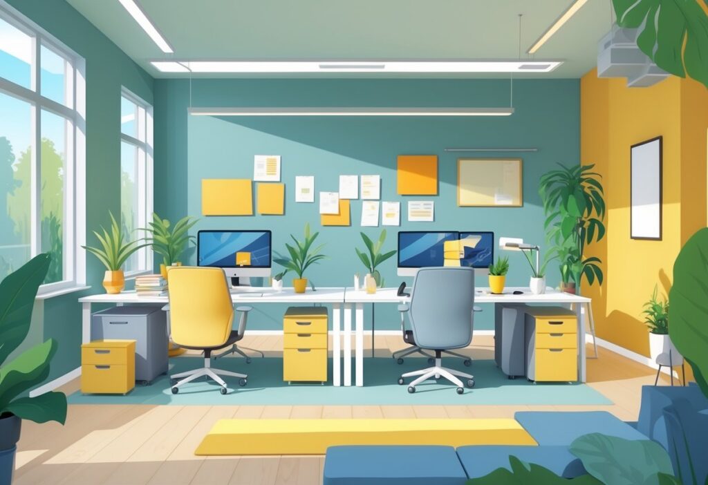
Best Office Colour Schemes for Productivity

Colour families each bring something different to the table. Cool colours help with focus and stress, warm colours ramp up energy and creativity, and neutrals keep things balanced.
Cool Colours: Boosting Focus and Calm
Blue is probably the top pick for focus and stress reduction. Add blue accents on feature walls or furniture to carve out zones that naturally encourage deep thinking.
Light blue shines in areas where you’re processing info or handling detailed work. Its link to stability helps keep your mind clear on complex projects.
Green is great for connecting your workspace to nature and easing eye strain. Sage green or soft teal are especially effective for long work sessions.
Key cool colours for productivity:
- Light blue: Boosts focus and communication
- Navy blue: Deepens concentration
- Sage green: Cuts stress and eye fatigue
- Teal: Mixes calm with creative energy
Pair these with white or light grey so the space doesn’t feel chilly. Blue also works well in meeting rooms where you need clear thinking and collaboration.
Warm Colours: Encouraging Energy and Motivation
Yellow sparks creativity and optimism—perfect for brainstorming or creative spaces. But don’t go overboard; too much yellow can feel agitating.
Orange brings energy and gets people talking. It’s a solid choice for team spaces or anywhere you want to boost enthusiasm.
Use warm colours in spots where you want more energy and motivation. A yellow accent wall in a creative corner or orange furniture in meeting areas can give you just the right nudge.
Effective warm colour applications:
- Soft yellow: Accent walls in creative zones
- Coral orange: Collaboration furniture and décor
- Warm terracotta: Feature elements in social spaces
Keep red minimal—maybe just a pop here and there—since too much can cause stress. The trick is to balance these energising colours with cooler ones to avoid overload.
Neutral Colours: Creating a Balanced Workspace
Neutrals give your office visual stability without being distracting. White and off-white make spaces feel clean and organised, which helps keep your mind clear.
Modern neutrals like warm grey or beige add a bit more personality than plain white, but still support focus. They’re a great base for adding accent colours that boost productivity.
Popular neutral combinations:
- White walls with blue accents
- Light grey base with green elements
- Warm beige with yellow highlights
- Cream backgrounds with teal features
Don’t go all-in on grey or beige—they can get dull fast. Use neutrals as your main palette and work in 20-30% of productivity-boosting colours.
The 60-30-10 rule is handy: 60% neutral, 30% supporting colour, 10% bold accent. It keeps things interesting but still professional and calm enough for real work.
Applying Colour Schemes Across Office Spaces
Every office zone needs its own colour approach. Collaborative areas thrive with energising oranges and warm tones, while relaxation zones work best with calming blues and greens.
Collaborative Spaces: Fostering Teamwork and Creativity
Orange and yellow shine in meeting rooms and brainstorming spots. They naturally get people talking and spark new ideas.
Use orange for accent walls or furniture, not the whole room. Pair these brights with neutral backgrounds like white or light grey.
Key colours for collaborative spaces:
- Orange: Fuels discussion and energy
- Yellow: Inspires optimism and ideas
- Warm reds: Adds urgency for quick decisions
- Coral tones: Softer than straight orange
Try one orange feature wall and keep the rest neutral. Yellow chairs or accessories can add a jolt of creativity without overwhelming the senses.
Lighting matters too. Natural light makes warm colours pop, and adjustable LEDs let you change the mood for different meetings.
Relaxation Areas: Designing for Stress Relief and Well-being
Break rooms and quiet zones need a totally different vibe. Soft blues and greens create a peaceful atmosphere that helps people recharge.
Sage green is a winner in rest areas. It connects you to nature and eases eye strain from staring at screens.
Effective relaxation colours:
- Soft blue: Lowers blood pressure and stress
- Sage green: Brings tranquillity and balance
- Lavender: Encourages relaxation and clarity
- Warm beige: Adds neutral comfort
Skip bright or stimulating colours in these spots. You want your relaxation areas to feel like a retreat from the daily grind.
Add natural touches like wood and plants to boost the calming effect. Matte finishes work better than gloss here—they give everything a softer, more restful look.
Productivity-Focused Work Zones: Maximising Output
Blue dominates productive workspaces because it helps people focus and concentrate. Different shades do different jobs here.
Navy blue suits detailed, analytical work. Lighter blues feel right for general office tasks.
You might try blue accent walls behind desks or bring it in through furniture and accessories. It’s easy to experiment with smaller touches before going all in.
Productivity colour strategy:
| Colour | Best Use | Effect |
|---|---|---|
| Navy blue | Analytical work | Deep concentration |
| Light blue | General tasks | Calm focus |
| Green accents | Computer work | Reduces eye fatigue |
| White/grey | Background | Minimises distractions |
Green goes hand-in-hand with blue in work zones. It eases eye strain during long computer sessions and keeps the vibe focused.
Stick with minimal distractions in these areas. Productivity zones should feel organised and purposeful, not too stimulating or too chill.
Choosing the Right Palette for Your Office
Building an office colour palette is all about balance—popular combos, smart accents, and what works for your space. Implementation looks different in open-plan offices versus private rooms.
Popular Combinations: Blending Colours for Optimum Results
Blue and white combos shine in focus-heavy environments. Blue calms and sharpens concentration, while white keeps things open and bright.
Grey and green pairings bring a professional, refreshing feel. Light grey grounds the space, and forest or sage green adds energy without going overboard.
For creative teams, sunny yellow accents with neutral backgrounds really lift the mood. Use yellow on feature walls or in furniture, but don’t go wild and cover everything.
| Colour Combination | Best For | Effect |
|---|---|---|
| Blue + White | Analytical work | Enhanced focus |
| Grey + Green | General offices | Balanced productivity |
| Beige + Orange | Collaborative spaces | Increased communication |
Monochromatic schemes—using different shades of one colour—look sharp and cohesive. Mixing up tones of blue or grey can feel timeless.
Warm neutrals with cool accents give you flexibility. Cream or beige walls with navy or teal details add interest without losing that professional edge.
Accents and Feature Walls: Enhancing Office Aesthetics
Feature walls behind reception or in meeting rooms draw the eye without taking over. Pick colours that fit your brand’s personality.
Paint one wall a bolder shade and keep the rest neutral. This trick works especially well in conference rooms where you want lively discussion.
Accent colours in furniture and accessories let you switch things up. Bright cushions, art, or planters bring in colour without a big overhaul.
Try contrasting colours thoughtfully. If your main palette is cool, sneak in warm accents through lighting or decor.
Ceiling treatments don’t get enough love, honestly. Light colours make the room feel taller, while darker ones bring it in and add coziness.
Think about directional colour flow. Warmer shades near social areas invite conversation, while cooler tones in quiet zones help people focus.
Tips for Implementing Colour Changes in Different Work Environments
Open-plan offices need careful colour zoning. Use different schemes to define areas—light colours for workstations, deeper ones for break-out spots.
Private offices can take bolder colours. Dark blues or rich greens set a calm, authoritative tone for executive spaces.
Meeting rooms benefit from hues that boost communication. Soft oranges or warm yellows encourage talking without being distracting.
Start small with new colour schemes. Test paint samples at different times of day before painting whole walls.
Consider your industry too. Creative agencies can go bold, but law firms might lean towards classic neutrals with subtle pops.
Factor in natural light—north-facing rooms need warmer colours to offset cool light, while south-facing spaces can handle cooler palettes.
Involve your team in the process. Their daily experience counts way more than any design trend, and buy-in makes change easier.
Frequently Asked Questions
Blue tones sharpen focus, while yellow gets the creative wheels turning at work. Lighter shades open up cramped offices, and where you put your colours really shapes mood and productivity through subtle psychology.
What wall colours are top-notch for boosting focus at work?
Blue is your best mate for staying focused at work. It sets a calm mood that helps your brain stick with tasks.
Light blue works especially well for solo workspaces. Pair it with whites or greys to keep things balanced.
Green is another winner for focus. It’s easy on the eyes and helps fight mental fatigue during long days.
Skip bright reds or oranges in focus zones—they’re too stimulating and make it tough to zero in on details.
Which hues ramp up the creative juices in an office environment?
Yellow is fantastic for sparking creativity and new ideas. It brings out optimism and confidence, so it’s great for brainstorming spots.
Orange works in collaborative areas where you want people to think differently. It gets folks talking and thinking together.
Purple can fuel creative thinking too. It’s tied to imagination and luxury, but use it sparingly as an accent.
Mix these lively colours with neutral backgrounds. That way you avoid visual overload but still get the creative boost.
Got any smart colour picks for pint-sized office spaces?
Light colours are your secret weapon for making small offices feel bigger. Soft whites, pale blues, and gentle yellows bounce light around and open up the space.
Cool whites make rooms feel airier. They’re also great for video calls—no weird glare.
Pale yellow adds warmth but keeps things feeling roomy, especially if your office lacks natural light.
Stick with dark colours just for small accents. Dark walls will box the space in and make it feel tiny.
What’s the lowdown on colour psychology for amping up productivity?
Blue helps cut stress and keeps things calm, making it easier to think clearly. It’s especially useful for work that needs focus.
Green balances out emotions and eases eye strain. It’s all about steady productivity and a sense of harmony.
Yellow gets your brain moving and boosts energy. Perfect for spaces where creative thinking or problem-solving happens.
Red amps up urgency and energy, but it can get overwhelming fast. Keep it to small accent pieces, not whole walls.
Looking for a colour scheme that meshes with modern office vibes – any thoughts?
Neutral backgrounds with bold accent walls nail that modern look. Think white or pale grey with a single wall in blue or green.
Sage green and warm wood tones are big right now—biophilic design brings a bit of nature inside and still feels professional.
Soft blues with metallic touches feel sleek and a bit techy. Add a few plants to soften the vibe and clean up the air.
Monochromatic schemes—mixing different shades of one colour—look sharp and modern. Try layering blues or greys for a subtle, unified feel.
Diving into Feng Shui – what colours are winners for office harmony?
Green stands for growth and new beginnings in Feng Shui. If you want to spark fresh ideas or encourage development, this is your go-to colour.
Blue, on the other hand, brings calm and trust. I’d say it’s perfect for meeting rooms.
It really helps set the mood for peaceful discussions and clear communication. Who doesn’t want that during a long meeting?
Earth tones like beige and brown give off stability and grounding energy. Try them in spots where you need to feel secure or just stay focused.
But watch out for too much red. Sure, it brings energy, but in an office, too much can crank up tension and even spark conflict.